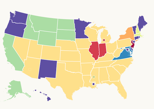
Something interesting from bit.ly – the Media map… this from the Bit.ly blog
We selected the 40 media properties included on the map first and foremost because they were heavily featured in our existing data set. We then narrowed the list down based on their footprint in the United States: high circulation newspapers, major TV news brands, etc. A media property was placed in a certain media category grouping (TV/Radio, Newspapers, News Magazines and Online Only) based on the primary distribution outlet for that news brand. For example, CNN is primarily a cable news channel, despite having a popular news website, so we placed CNN in the TV/Radio category. We wanted to include more media properties but the map started to get too difficult to read in a useful way, so we had to limit each category to 10 media properties.
And that is how the Bitly Media Map came together. If you have half as much fun viewing the map as we had building it, well, then, we had twice as much fun building the map as you had viewing it! (Sorry, data science joke.) Be on the lookout for new and exciting projects from Bitly Labs!
Check out the new Bitly Media Map

We heavily used d3.js, an extremely popular javascript library that enables the rapid development of beautifully rich, data-driven visualizations. A gallery of examples of the types of things that can be built with using d3 can be found here: https://github.com/mbostock/d3/wiki/Gallery.
Source: Bitly, http://blog.bitly.com/post/62999399401/introducing-the-bitly-media-map