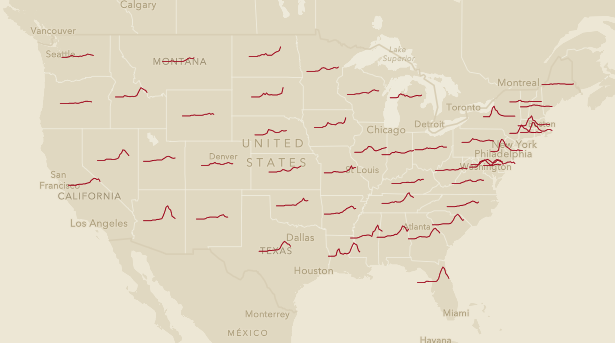
REDLANDS, Calif.—Esri, the global leader in location intelligence, announced today that it released a new app (https://livingatlas.arcgis.com/covidpulse) to help stakeholders and the public understand how COVID-19 is trending in every state and county in the US. The daily-updated app, which visualizes trend lines for new cases, deaths, as well as cumulative cases, tracks case data compiled by Johns Hopkins University from January 2020 to the present. At a glance, users can easily see where cases are spiking, declining, or holding steady.
Explore COVID trends in every US state and county with new @Esri COVID Pulse app
Tweet this
“This app empowers stakeholders and leaders to make scientific, data-driven decisions about what comes next for their community when it comes to COVID-19,” said Dr. Este Geraghty, Chief Medical Officer at Esri. “The ability to explore case data over time and compare one place to another is critical to understanding if communities should begin to reopen schools and businesses, continue with current restrictions, or ramp up mitigation efforts.”
You can also examine how past decisions have played out in terms of COVID cases. For example, Orange County, North Carolina, home to University of North Carolina at Chapel Hill, shows a clear spike as students returned to campus for in-person learning.
Dr. Geraghty has recorded a short, 3-minute video showcasing the app and how to use it here: https://www.youtube.com/watch?v=OyU17RKh3xs&feature=youtu.be