People are always interested in comparing wages and cost of living data it seems. This story map does a super job of sharing the relative cost of living around the country as well as identifying wage gaps.
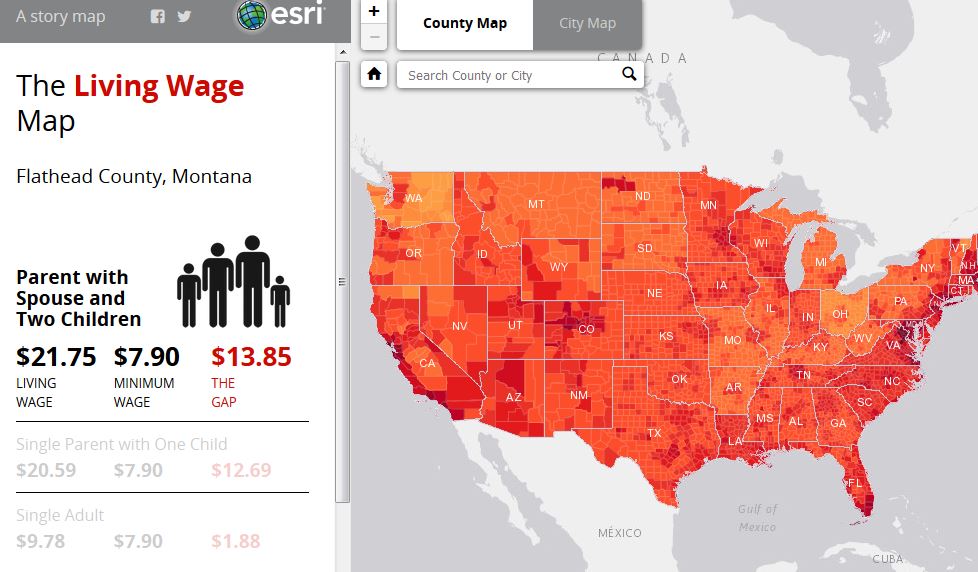
About the map: An ongoing public debate about the struggle of low-income families to stay afloat raises a key question: how great is the gap between the minimum wage and the amount of money needed to meet a minimum standard of living? The Living Wage Calculator, developed by Professor Amy Glasmeier of MIT, examines this question. Esri has map-enabled the Calculator data, revealing regional patterns.