Some interesting visualizations coming from NASA these days, this latest effort revealing the dispersion of smoke from wildfires over the continental US. About the map… The map below depicts the relative concentration of aerosols in the skies above the continental United States on June 26, 2012. The map was assembled from data acquired by the Ozone Mapper Profiler Suite (OMPS) on the new Suomi National Polar-orbiting Partnership (S-NPP) satellite. Aerosol are tiny solid and liquid particles that have an outsized impact on weather and climate. Their concentrations are represented above in shades of red and yellow, with the highest concentrations in deep red and the lowest in light yellow. Grays represent clouds or areas where no reliable data were available.
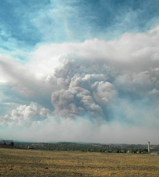
In the image, the aerosol signal is strong to the north and east of the North Schell, Dump, and Wood Hollow fires in Nevada and Utah. Thick smoke plumes from wildfires across Colorado moved east and south into the plains states.

Source: earthobservatory.nasa.gov via Glenn on Pinterest