GIS user technology news

News, Business, AI, Technology, IOS, Android, Google, Mobile, GIS, Crypto Currency, Economics

  • Advertising & Sponsored Posts
    • Advertising & Sponsored Posts
    • Submit Press
  • PRESS
    • Submit PR
    • Top Press
    • Business
    • Software
    • Hardware
    • UAV News
    • Mobile Technology
  • FEATURES
    • Around the Web
    • Social Media Features
    • EXPERTS & Guests
    • Tips
    • Infographics
  • Blog
  • Events
  • Shop
  • Tradepubs
  • CAREERS
You are here: Home / *BLOG / Around the Web / Map of the Day – The Living Wage Story Map

Map of the Day – The Living Wage Story Map

April 22, 2016 By GISuser

People are always interested in comparing wages and cost of living data it seems. This story map does a super job of sharing the relative cost of living around the country as well as identifying wage gaps.
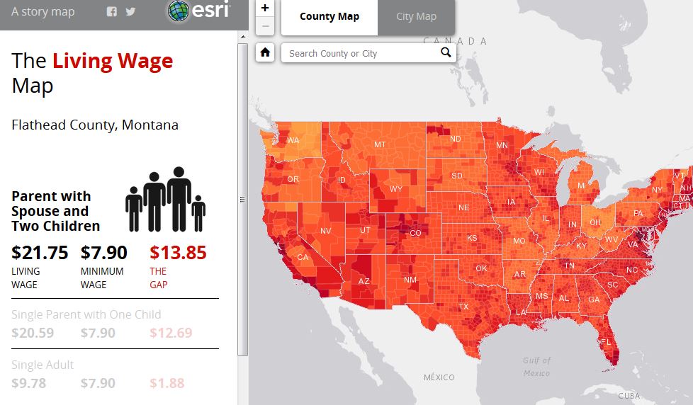
living wage map

About the map: An ongoing public debate about the struggle of low-income families to stay afloat raises a key question: how great is the gap between the minimum wage and the amount of money needed to meet a minimum standard of living? The Living Wage Calculator, developed by Professor Amy Glasmeier of MIT, examines this question. Esri has map-enabled the Calculator data, revealing regional patterns.

See the map HERE

Filed Under: Around the Web, Maps and Cartography Tagged With: ESRI, map of teh day, MOTD, story map

Copyright gletham Communications 2015 - 2026

Go to mobile version