Cartographers take pride in their work, typically applying all the rules and principles of good cartographic design to their work, all in an effort to make people want to look at and appreciate their work (See Esri, Make Maps People Want to Look at). However, in this new era of social sharing it seems that the map has been replaced by the Infographic and the data visualization – a mashup of data, graphics, and maps presented in an effort to tell a story. Now us geographers are well aware of story telling via the map, however, to this new breed of data visualists the focus has sadly been on quantity rather than quality. Bloggers, publishers, newspapers, etc… run to the web, download data and mashup the results in creative and not so creative ways, the end result is often a map but sadly, the final product is also something your GEOG 101 Prof would likely slap you for if you called it a map!
The Ugly Map – Source: ObliviousAT
Yep, gone are the days of cartographic principles, map design standards, scale, composition, and elements of good map design. Now don’t get me wrong, there’s still TONS of mapping and GIS professionals out there churning out fabulous work (just walk around the Map Gallery at the annual International ESRIUC and that’s obvious!). But today it seems all the headlines, fame, and accolades for great maps are showered on bloggers, and authors of sexy Infographics and data visualizations who are striving to get a front page mention from Mashable and the Huffington Post!
From these map creators we rarely see any signs of the creators giving thought to the colors being used to present the data let alone considering visual contrast and the application of effective color ramping as an example. And what about the organization of data, selection of appropriate symbology, and even a small effort to balance the map elements? Today’s visualization (or can I call it a social media map?) often neglects most of the issues raised here let along give any consideration to the map clarity, projection, scale, orientation or map composition yet people love them! Go figure…
As an example, I recently featured a news story that identified the top areas in the USA where STEM jobs are found. A hot article indeed and the focus of the piece was the map which attempted to convey the results (see below). Sadly, the map was confusing and completely missed the goal which was to display and rank some 150 cities where STEM job opportunities exist. The map uses and odd color selection for a color ramp where the reader is expected to rank places from #1 to #150 based on color and symbol size – huh? Additionally, the colors selected to display hot-cold is a total miss – perhaps they should have consulted Colorbrewer for some advice first as well as this fine read on the art of scaling symbology. Now don’t get me wrong, the colors are “pretty” but they really don’t help tell the story. I recall Gretchen Peterson recently critiquing a Map in a blog post titled Map Critique Friday – I have to wonder what would make Gretchen Squirm with this map? I’m sure there’s a couple of things! Another professional that I suspect would have something to say about the map is John Nelson from IDV – when it comes to creating amazing maps and data visualizations, John is the man! You can find his blog HERE for fabulous tips and tricks on great map design or seek him out on Twitter @JohnNelsonIDV

On the heels of our earlier report on the Best & Worst Cities to Find a Job, WalletHub analyzed the 100 most populated metropolitan statistical areas across 11 key metrics to help STEM professionals find the best markets for their valuable occupations.
A recent Tweet I posted about the article mentioned above generated a little bit of discussion which promoted me to share via this article… See Tweet HERE
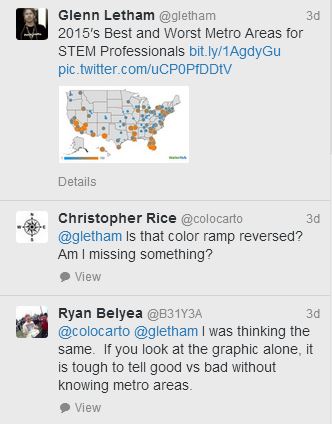
Discussion on Twitter
The biggest culprit in today’s world of web publishing and Data Visualizations gone wrong I suspect is that visualization artists are using graphic creation software tools that lack any specific cartographic tools. Maps and mashed up with data using Google Docs, PowerPoint, PicMonkey, and many others. Solutions are popping up every day to help authors easily create data visualizations. These are simple, wizard driven and design to absorb data and spit out charts, tables, graphs, and maps – the options for manipulating your map to make it clear, legible, and cartographically sound are typically lacking though. Some of the popular tools available include infogram, Piktochart, Venngage, and Visual.ly.
Today’s map is often created for Buzz! A catchy headline and a map that mashes up some “cool” data in order to to go viral and stir the pot is what gets the headlines, like the map below from Mandatory.
map of sluttiest states in America – Source: Mandatory
These common, and often free, apps are often the tool of choice, rather than seeking out the more specialized (and appropriate) packages like Explorer from Esri, Avenza’s MAPublisher cartography software, Photoshop, MapMaker, or CadCorp MapExpress. The reason for this is likely that specialized software requires special talents as well as more patience and time. For the author looking to find a quick solution to mashup data and churn out maps, the traditional mapping software is just too much work. Perhaps a better solution would be for them to consider some of the fine Map creation solutions that are wizard driven and run online as web services. These typically involve setting up an account, selecting a map template, theme, color styles, uploading data or connecting to a GeoRSS feed and hitting the “Map It” button! Solutions that come to mind immediately include ArcGIS Online, Google Map Maker, ZeeMaps, Click2Map, National Geographic MapMaker, IDV VisualFusion, and this cool solution you may no know, Mapbiquity.
Somewhere in this era of web publishing everywhere by everyone there likely exists a happy medium for effective map design for Infographics. A simple to use, online solution that provides the simplicity of use of the wizard-driven visualization authoring tools combined with the richness and professional capabilities enabled by professional map making solutions and services. Sadly, the user often has the expectation of Free.
Have you found the ideal solution?
Useful Weblinks:
- Make maps people want to look at
- Cartographic design principles (Ordnance Survey)
- 14 Tools for creating engaging Infographics
- Cartographer’s Toolkit
- GIS Cartography: A guide to effective map design
- Engage your audience with professional infographics for your newsletters with Canva
Author: Glenn Letham @gletham
